Find a Showroom
Choose the Perfect Colored Window Blinds
Colored window blinds come in a wide range of colors and finishes, from natural wood tones to painted wood looks and sleek metal finishes. Plus, if blinds colors don’t quite suit your aesthetic, there are lots of colors and patterns for shades so you’re bound to find the right look for your space.
Before diving into some of your color options for blinds and shades, first make sure you understand the difference between these two similar window treatments.
what are Blinds & Shades?
Blinds traditionally feature horizontal slats made from a sturdy material like wood or metal. The slats on the blinds can be tilted up or down to control your light and privacy. With Cordless Wood and Metal Blinds, you can also lift and lower the blinds to cover and uncover your window.
Shades are single-panel window treatments made from a variety of materials from hard textiles to luxuriously soft fabrics to woven fibers. Shades can only be lifted and lowered to control your light and privacy and they come in a wide variety of styles to suit your aesthetic.
Now that you understand the differences between blinds and shades, dive into your color options for both to discover the right colored window blinds or shades for your space.
Blinds Colors to Choose From
Blinds colors fall into three main categories: real wood colors, painted wood colors and metal finishes. Discover each category and see examples of each to learn about your options for colored window blinds and get a sense for which category will best suit your aesthetic.
Natural Real Wood Tones
Natural Wood Blinds are a classic window treatment option. These colored window blinds come in a variety of real wood grains and finishes from simple straight grains to highly varied exotic-wood-inspired grains. Real wood blinds colors are typically best suited to aesthetic styles that champion natural wood tones, such as mid-century modern homes, Scandinavian-inspired homes and traditional or southern homes.
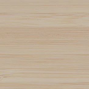
Wood Blinds, 2-Inch Bamboo, White
A light, honey-colored wood tone with a simple straight grain and subtle highlights and lowlights.
Wood Blinds, 2-Inch Laminated, Bleached Oak
A bright wood tone with a soft open straight grain and subtle color variation that resembles white oak.
Wood Blinds, 2-Inch Basic, Cherry Wood
A rich, warm color with a hand-scraped finish for a sophisticated, bold look that resembles cherry wood.

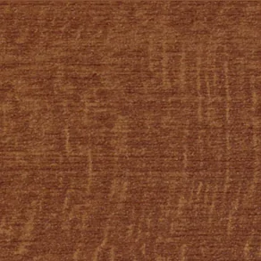
Wood Blinds, 2-Inch Exotic, Ebony
A highly varied grain and striking coloring for a character-rich look reminiscent of exotic wood.
Painted Wood Tones
Painted wood offers a simple, modern look for your space. Painted wood blinds colors typically stick to more neutral tones like white, grey and black. Depending on the finish, painted wood tones may show some grain pattern through the paint, or it may cover it completely for a sleek, simple surface. These colored wood blinds offer a clean, simple appearance and so are better suited to modern or minimalist homes.

Wood Blinds, 2-Inch High Gloss, White
A bright white with a glossy surface for an elevated look with a touch of glamour.

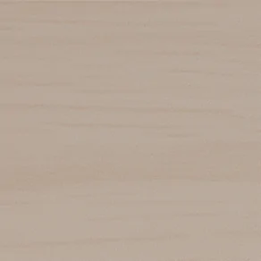
Wood Blinds, 2-Inch Painted Bamboo, Dune
A muted sandy tone with a straight wood grain barely visible for subtle texture.

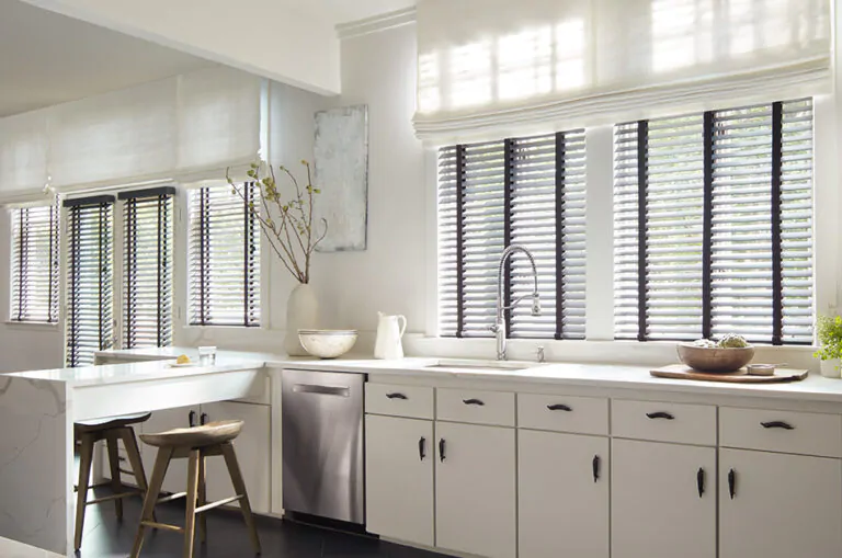
Faux Wood Blinds, 2-Inch Faux, Dark Grey
A deep warm grey color that delivers a touch of visual impact to your space.

Wood Blinds, 2-Inch Matte, Coal
A true black with a matte finish for dramatic look and bold linear design.
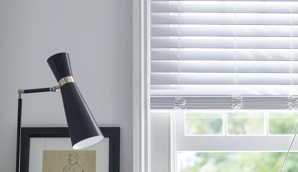
Sleek Metal Finishes
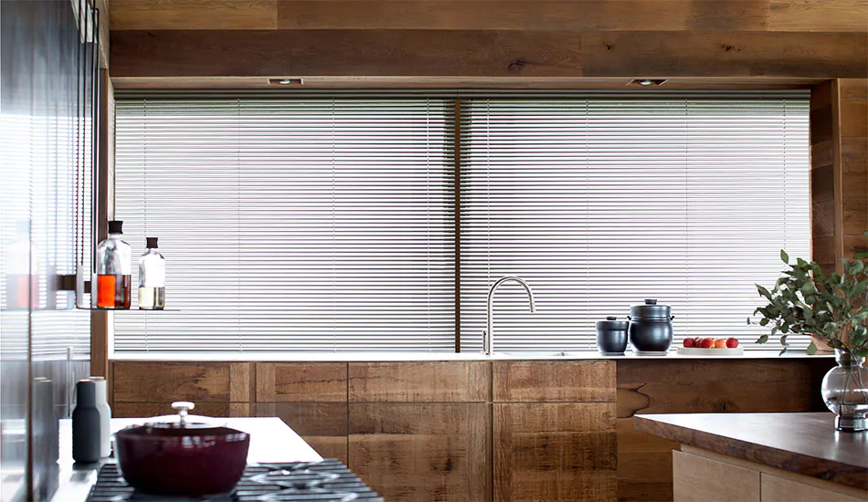
Metal Blinds, made from either 1-inch or 2-inch durable yet light aluminum slats, offer several metal finishes, some with a matte finish and others with a metallic sheen. These colored window blinds are ideal for adding a metallic element to the interior décor of industrial-chic or modern homes. They can also be used in glam interiors to add more shine to an already extravagant design. Keep in mind that 1-inch Metal Blinds are only available with wand tilt control, and you won’t be able to lift and lower them. 2-inch Metal Blinds are available with lift and tilt control options.

Metal Blinds, 2-Inch Metal, White Pearl
A soft white with a subtle brilliance.

Metal Blinds, 2-Inch Metal, Silver
A classic silver with a soft sheen.

Metal Blinds, 2-Inch Metal, Champagne
A beautiful golden hue with a subtle sheen.

Metal Blinds, 2-Inch Metal, Night
A rich black tone with a touch of shine.
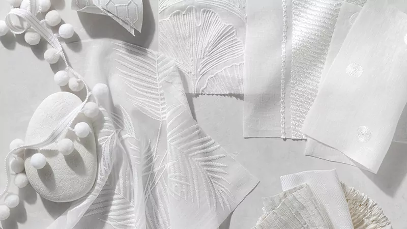
Find Even More Colors with Shades
If colored window blinds aren’t quite striking you as the best choice for your aesthetic style, you have even more options in Shades. Shades are a great alternative to blinds as they offer similar functionality in even more styles. Each style of shade offers their own material options that range significantly in terms of colors, patterns and textures so you can find the right look for your space.
Learn about each type of shade and its aesthetic options to see which one might suit your preferences.
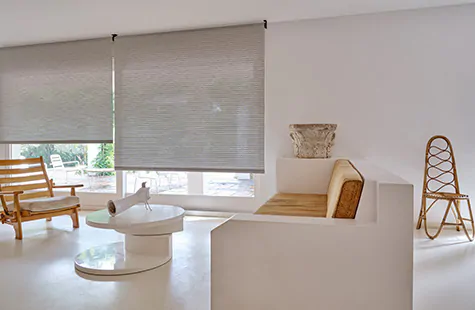
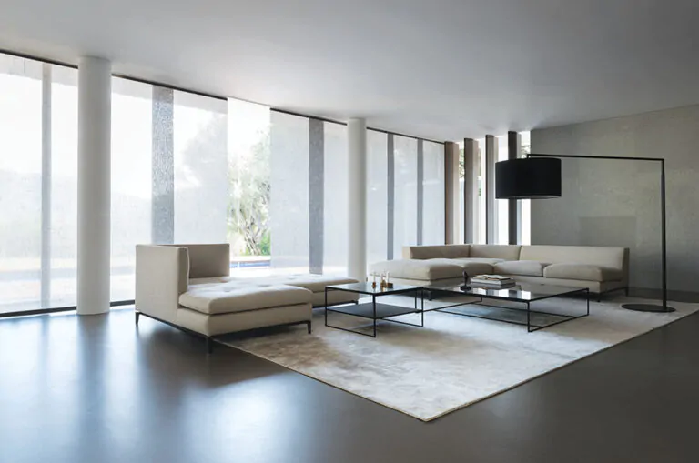
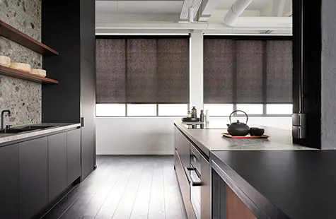
Roller Shades
Roller Shades are a great alternative to colored window blinds with their sleek design and installation versatility. Roller Shades are available in light-filtering and blackout materials so you can achieve the right amount of privacy and light control. Solid colors range from subtle neutrals to bright colors, while patterns offer simple to intricate designs. You can also get unique designer patterns created by interior designers like Nate Berkus, The Novogratz and more.
double roller shades
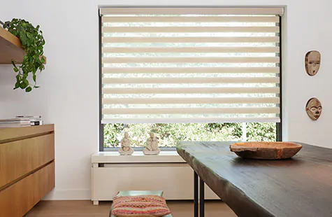
Capture a similar look to colored window blinds with Double Roller Shades, also called “zebra blinds,” that feature alternating bands of sheer and opaque material. Colors for these shades are all neutral tones ranging from white to beige and grey to black, so you’re bound to find an option that suits your interior.
solar shades
Similar to Roller Shades in their style, functionality and versatility, Solar Shades come in light-filtering material that blocks UV rays while still allowing natural light to flood your space. Colors are mostly neutral tones including white, beige, grey and black, and different materials also offer lots of texture variation. You can also choose from designer colors, textures and a few patterns from well-known brands, Sunbrella® and Chilewich®.
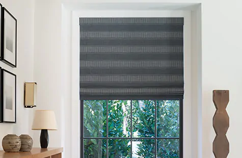
roman shades
Roman Shades come in functional and decorative styles and offer lots of privacy and light control variation with different fabric types and lining options. Solid colors include neutral tones, pastels, bold jewel tones and more. You can also find simple and intricate patterns, including designer patterns created by interior designers like Nate Berkus, Victoria Hagan and more.
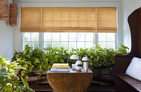
woven wood shades
Woven Wood Shades offer four functional styles and are made of natural fibers like bamboo, grasses and reeds. Colors are all natural in tone from warm honey-colored shades to cool sun-bleached grays and dark, richly hued wood tones. Materials vary in texture from elegant smooth textures to coarse character-rich textures.
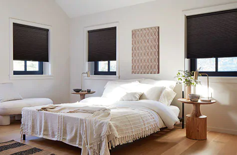
cellular shades
Featuring a unique honeycomb design that provides excellent insulation, Cellular Shades offer a similar linear look to blinds without the tiltable slats. These shades are very easy to use and lift and lower the same way as blinds. Light-filtering and blackout materials are available so you can achieve the right level of light and privacy control. Colors are all on the neutral spectrum, with some warm and cool tones with a touch of color like blue, green, red or yellow.
Factors to Consider When Selecting Shades or Blinds Colors
When selecting colored window blinds or shades, there are a few factors to consider to help you choose the right color for your space:
- Room size and lighting – Large bright rooms are often best balanced with a darker, richer color, while darker, cozier spaces may benefit from a lighter color to brighten things up and make the room feel more spacious.
- Existing color scheme – Your colored window blinds should complement the existing interior color scheme, either with a newly introduced accent color that provides pleasing contrast or with a color pulled from your existing color palette that blends in harmoniously.
- Light and privacy control – In terms of blinds colors, all colors and finishes provide the same level of light and privacy control since the sturdy, solid slats will block light and will totally block the view when fully tilted up or down. For shades, however, different materials have varying levels of light filtration and privacy control. For instance, light-filtering Roller Shades will provide less privacy and light control than blackout Roller Shades. For Roman and Woven Wood Shades, you have the option of adding privacy or blackout lining to your fabric to achieve the right level of light and privacy control.
- Material durability – All colored window blinds are made from durable, hardy material; however, you may experience some color fading of Wood and Faux Wood Blinds over time from exposure to the sun. For shades, the durability of the material varies based on the material’s composition. In general, synthetic materials like Roller and Solar Shade textiles as well as performance Sunbrella fabrics for Roman Shades are very durable and won’t fade easily. However, natural fabrics for Roman Shades, like wool, linen and silk, are a bit more vulnerable to the sun, so may fade and deteriorate over time. To prevent this, add lining, which will help protect the integrity of the fabric.
Color Inspiration
With an overview of your options for shades and blinds colors as well as tips for choosing a color, you’re ready to explore inspirational interiors to get ideas for your own design. See colored window blinds and shades in curated spaces and learn how they complement their existing interiors.
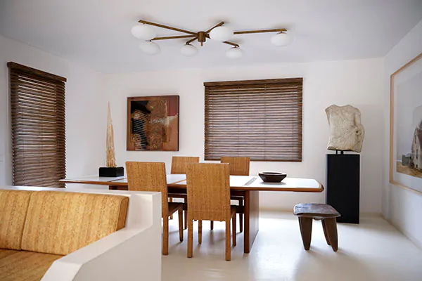
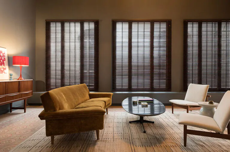
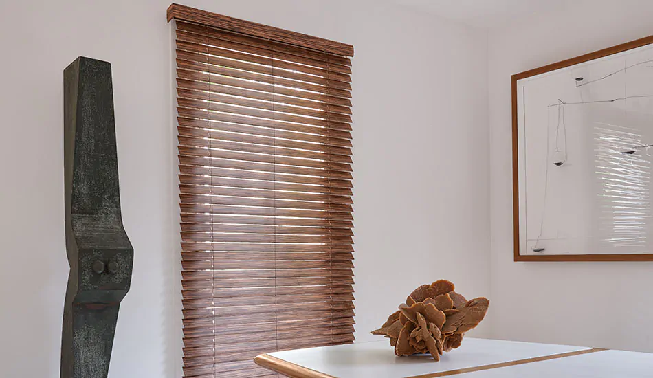
Blinds in a Mid-Century Modern Dining Room
Wood Blinds are perfectly suited to mid-century modern rooms thanks to the aesthetic style’s emphasis on natural wood tones and clean lines. The warmth of the wood contrasts nicely with cooler elements in your space like black and white accents for a balanced look and feel. Be sure to echo similar wood tones throughout your interior design, such as in furniture and décor pieces for a cohesive aesthetic.
Pictured: Wood Blinds, 2-Inch Exotic in Zebrano
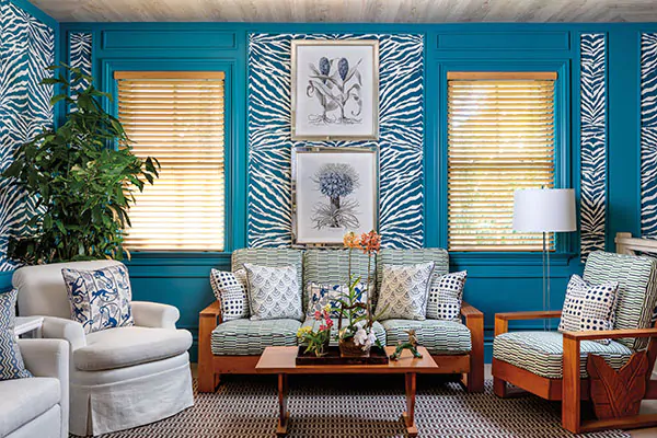
Blinds in a Bright Tropical Room
For a vibrant tropical-inspired room, Wood Blinds can bring a welcome natural texture and warm tone to the space to balance the coolness of blues and greens that are common in coastal and tropical designs. Capture the warmth of a sandy shore on a sunny day with light golden colored window blinds, such as 2-Inch Bamboo in Natural. The honey gold wood will also compliment any gold or bright yellow elements in your space such as gold picture frames or bright yellow flowers.
Pictured: Wood Blinds, 2-Inch Bamboo in Natural
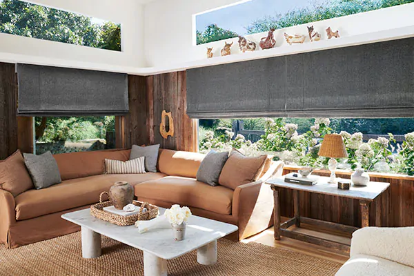
Shades in Desert-Inspired Earthy Tones
For a family room with inviting desert-inspired earthy tones, opt for shades in a stony grey color like Lowell Tweed in Flint to contrast with warm rusty red-stone-inspired colors. The texture of the tweed-like fabric in the earthy grey color delivers lots of visual depth, especially when combined with other textures like natural wood on the walls and woven fibers in décor pieces.
Pictured: Flat Roman Shade, Nate Berkus, Lowell Tweed in Flint
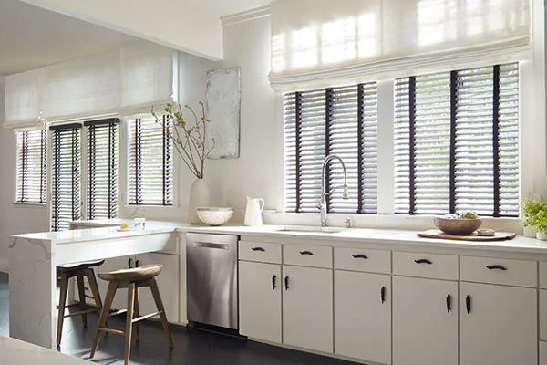
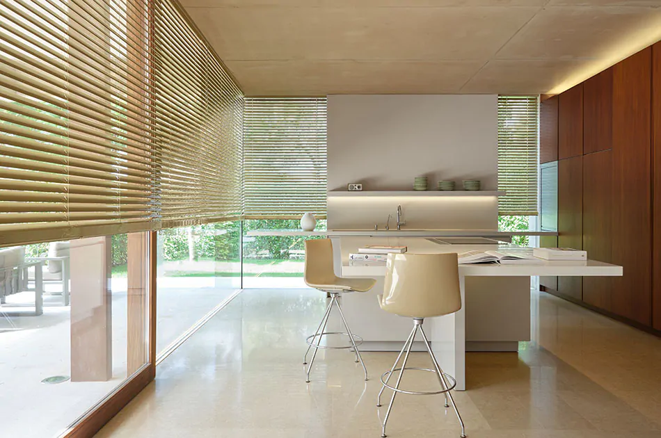
High Contrast Blinds & Shades
Can’t decide between colored window blinds or shades? Choose both for a multi-dimensional, layered look. For a bright modern kitchen, create some balance with dark blinds, such as 2-inch Painted Bamboo in Coal. To keep the bold lines of your blinds from feeling to harsh, layer Roman Shades in a bright color, similar to the color of your walls, such as Tangier Weave in Blanco to blend in with white walls.
Pictured: Outer Layer: Flat Roman Shades, Martyn Lawrence Bullard, Tangier Weave in Blanco and Inner Layer: Wood Blinds, 2-Inch Painted Bamboo in Coal
Discover the Perfect Colored Window Blinds or Shades
With a better understanding of your options for colored window blinds and shades, as well as inspiring examples, it’s time to find the perfect color for your space. Order free swatches of all your favorite shades and blinds colors to compare at home. Be sure to look at not only the color and tone, but also the grain in any wood swatches and textures in fabrics to ensure you capture the perfect look for your room.
ORDER YOUR FAVORITE SWATCHES FOR FREE
Compare as many of your favorites from our collection of 1,200+ premium materials at home when you order free swatches online.