Find a Showroom
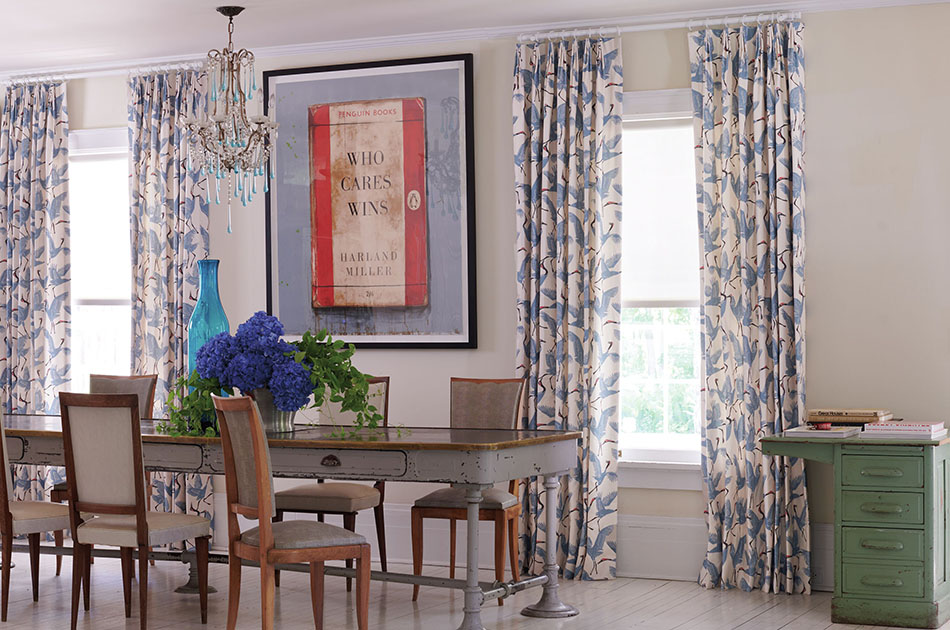
Enhance Your Interior with Colorful Curtains
Curtains play an essential role in your home. They are not only functional in their ability to provide privacy and light control, but they also contribute to the overall aesthetic appeal of your space. While there are many options available, colorful curtains provide varying degrees of visual drama that bring your space to life.
Colorful drapes come in a wide range of colors and patterns from beautiful solid jewel tones to bright intricate designs to subtle pastel patterns. Finding the right match for your space will depend on your existing color scheme and personal preferences.
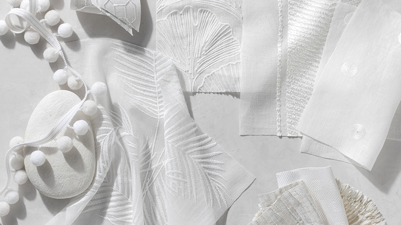
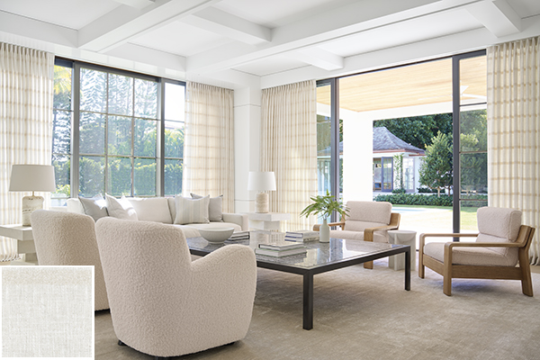
Cover photo: Tailored Pleat Drapery, The Novogratz, Family of Cranes in Waverly Blue
Tips for Choosing Colorful Curtains
Your colorful curtains should suit your existing color scheme while achieving the look you want. First, review a few helpful tips in thinking through the right colors for your drapery. Then, answer some frequently asked questions to help you further narrow down your choices for the right colorful drapes.
- Think about what visual effect you want your colorful curtains to have in the room. Do you want a bold, striking design element or a subtle complement to your existing interior?
- Consider your existing color scheme and how your colorful curtains will fit into it. In terms of color combinations, it’s important to understand a bit about color theory and the color wheel. Generally, common color combinations fall into one of these categories:
- Monotone, different shade of the same base color in the room.
- Analogous, an adjacent color on the color wheel to your existing colors.
- Complementary, the exact opposite color on the color wheel to an existing color.
- An accent color, a triadic or tetradic new color to add another element to your space.
- Think about color psychology, which refers to the physiological effect the color has on the room. For instance, cool tones like blues, purples and greens tend to have a tranquil, calming effect while warm tones like reds, yellows and oranges have a more energizing, inviting effect on a room.
Along with above tips, these FAQs can help you narrow down your selection for colorful drapes further:
which color is best for curtains?
The “best” color for your space will depend on your preferences. Are you trying to create a cozy ambiance? Try warm neutrals like creamy beige or opt for a dark jewel tone like burgundy or amethyst. Or are you looking for a vibrant, bold statement? Try bright, saturated hues like sky blue, peony pink or sunflower yellow.
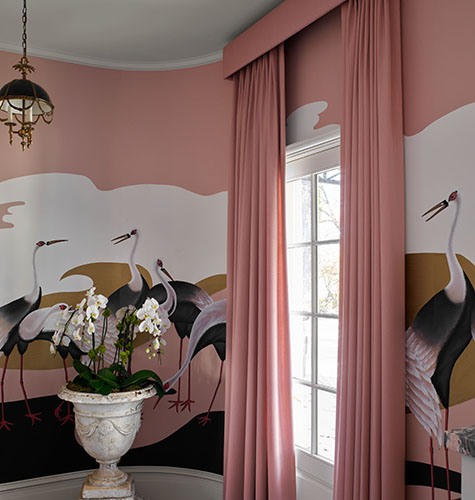
Pictured: Tailored Pleat Drapery, Holland & Sherry, Andes in Blush, design by Julie Dodson, photography by Emily Followill for the 2022 Flower Showhouse
What Color Curtains Are in Style?
Recent window treatment color trends show warm neutral tones like warm greys, tans and beiges as popular choices. These colors are versatile and complement any décor style, making them a safe choice that’s bound to look good in your space.
Should Your Curtains Match Your Wall Color?
A good rule of thumb for a simple, subtle look is to choose curtains that are just a shade or two lighter or darker than your wall color. However, if you want to make a bold statement, you can choose colorful drapes that contrast with your walls.
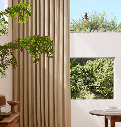
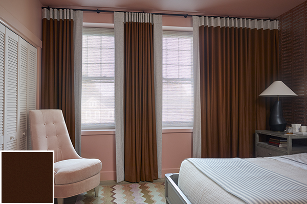
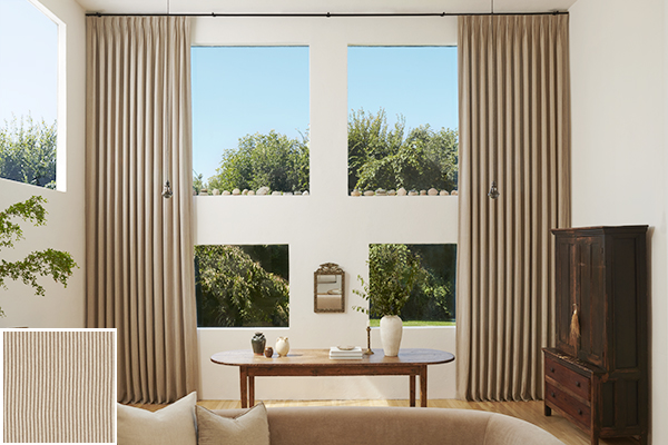
Pictured: Pinch Pleat Drapery, Nate Berkus, Surrey Stripe in Morel and Natural
What Color Curtains Make a Room Look Bigger?
In general, lighter tones make a room appear more spacious and airier while darker tones make a room feel cozier. But to make your room look bigger, it’s about more than just color: How you hang your curtains is also a huge factor in creating the illusion of height and space.
Options & Inspiration for Colorful Drapes
Now that you know some of the important factors to consider when choosing colorful curtains, it’s time to explore a selection of colors as well as inspirational imagery. These colors and inspirational spaces are categorized by color temperature so you can explore the category that best suits your existing interior color scheme.
- Warm Colors
- Cool Colors
- Neutral Colors (warm and cold)
Warm Colors: Red, Orange & Yellow
Warm colors are those that typically have undertones of red, orange and yellow. These tones typically evoke a sense of coziness and energy. This invigorating effect is ideal for rooms like living rooms, dining rooms and other spaces where you host guests, as the color can create a vibrant atmosphere that encourages conversation.
Fabric Options
Explore a few examples of warm tones for colorful curtains, ranging from soft pastels to bold jewel tones.
Holland & Sherry, Wool Flannel, Floral Pink
A luxurious, soft wool with a brushed finish in a lovely pastel pink.
Silk Dupioni,
Marigold
A fine silk with a lustrous sheen and soft texture in a bright floral yellow.

Posh Velvet,
Crimson
A lustrous, lightweight velvet with a soft touch and a rich red wine color.
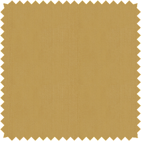
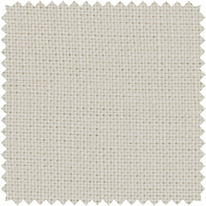
Linen,
Mink
A durable, soft linen fabric in a deep, bark-like brown with warm undertones.
Warm Color Inspiration
Discover inspiring spaces curated with warm-toned colorful drapes to gather ideas for your own room.
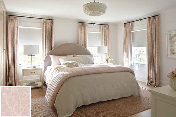
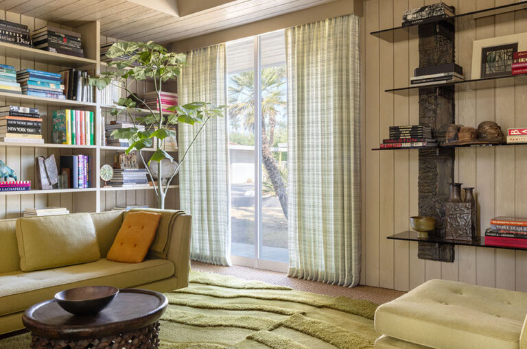
Warm, Inviting Bedroom
For a cozy, inviting bedroom, opt for a soft, warm color like Chinoiserie in Blush for your colorful curtains. Pair the pale pink with warm, neutral tones like creams and beige for an inviting, analogous color scheme. Plus, despite the light color of your Drapery, when lined with blackout lining and paired with Blackout Roller Shades in a soft white like Ava in Birchwood, you’ll enjoy a tranquil room darkening effect.
Pictured: Outer Layer: Tailored Pleat Drapery, Martyn Lawrence Bullard, Chinoiserie in Blush and Inner Layer: Roller Shades, Ava in Birchwood
Richly Hued Jewel Toned Bedroom
Evoke a mix of inviting warmth and energy with warm-toned, richly hued jewel tones, like Posh Velvet in Burgundy. Break up the deep color with an eye-catching border trim for your colorful curtains in a light, warm, off-white tone used as an accent color. For the rest of your space, keep it warm and vibrant with a monochromatic color scheme with lighter and darker shades of your curtain’s jewel tone.
Pictured: Outer Layer: Ripple Fold Drapery, Posh Velvet in Burgundy with trim and Inner Layer: Flat Roman Shade, Bryce in Biscotti, design by Virginia Toledo for the 2022 Kaleidoscope Showhouse
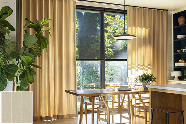
Sunny Dining Area
Create a vibrant dining area with golden-hued colorful curtains, such as Dashing Stripe in Palomino. Complement the golden fabric with a monochromatic color scheme using light honey-colored wood furniture for your dining set. To ground the space, choose black as an accent color for décor elements such as shelving, light fixtures and your window frame. Adding Solar Shades in 10% Black can also add a dark element without feeling overwhelming, thanks to its transparency level.
Pictured: Outer Layer: Cubicle Drapery, Holland & Sherry, Dashing Stripe in Palomino and Inner Layer: Solar Shades, 10% in Black
Cool Colors: Blue, Green & Purple
Cool colors have undertones of blue, green and purple and typically evoke a sense of serenity and relaxation. These colors are calming and peaceful, making them ideal for bedrooms, bathrooms and other rooms of tranquil solitude.
Fabric Options
Explore a few examples of cool tones for colorful curtains to get a sense of your options for these calming colors.
Silk Dupioni,
Lavender
A fine silk fabric with a lustrous sheen and soft texture in a cool purple hue.
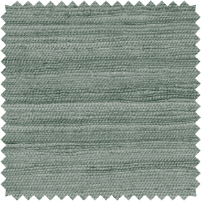
Raw Silk,
Sage
An untreated silk in a soft, cool grey green that features natural texture.
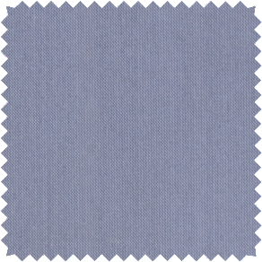
Holland & Sherry, Wool Flannel, Rain
A soft wool with a slightly brushed finish in a beautiful sky blue.
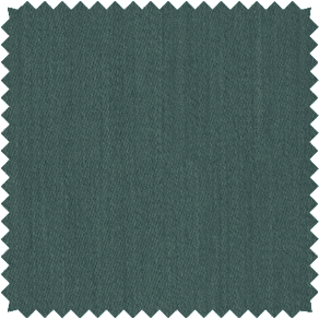
Holland & Sherry Andes, Algae
A soft, sumptuous wool with a subtle luster in a deep blue green.
Cool Color Inspiration
Discover inspiring spaces curated with cool-toned colorful drapes to gather ideas for your own room.
Calm, Coastal-Inspired Bedroom
Combine cool, light blue Drapery, such as Vanda in Sky, with sandy tones for a coastal-inspired, complementary color scheme. Wood-toned furniture with woven seats and backing as well as blue patterned accent pillows add additional texture and dimension while sticking to the cool color scheme. For a third accent color, use bright white in your bedding and a few décor pieces to brighten the space.
Pictured: Tailored Pleat Drapery, Victoria Hagan, Vanda in Sky
Tranquil Office Space
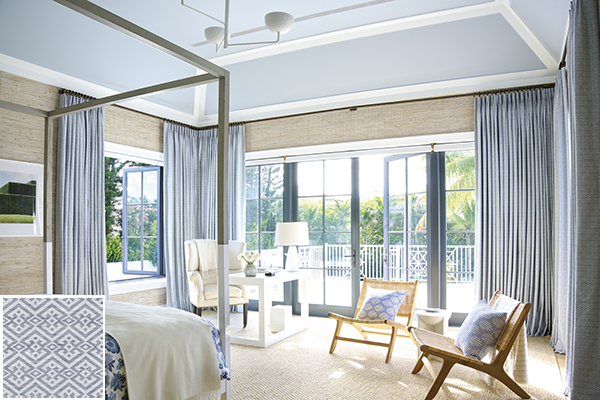
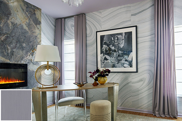
Design a calming, tranquil space to work with colorful curtains in a cool tone like Andes in Lavender Mist. The soft, light purple color creates a peaceful atmosphere, ideal for an office space where stress can sometimes run high. For a contemporary look, and added visual interest, pair your purple curtains with marble-inspired wallpaper featuring a similar cool color temperature. Add a complementary color to your space with a muted gold desk and décor which will beautifully harmonize with the purple hue while also adding a touch of luxury to tie into the marble-inspired wallpaper.
Pictured: Outer Layer: Ripple Fold Drapery, Holland & Sherry, Andes in Lavender Mist, designed by Tish Mills for the 2022 Kips Bay Palm Beach Showhouse
Relaxing Living Room
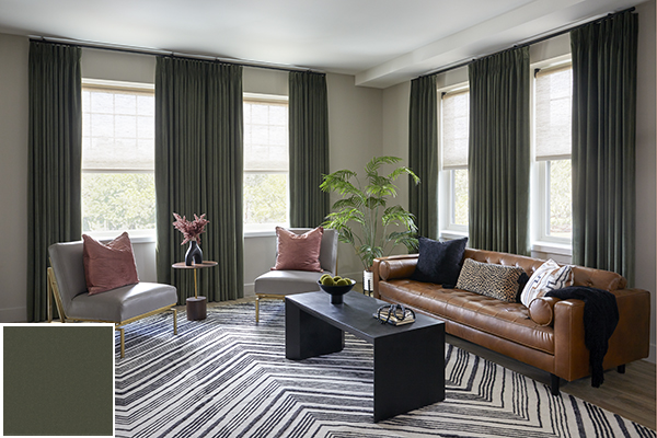
Create a relaxing atmosphere with deep green curtains, such as Posh Velvet in Dark Green. The richly hued, nature-inspired tone creates a calming, tranquil ambiance. For depth and dimension in your design, choose tetradic accent colors that complement your green, such as deep blues, warm browns and deep, muted purple tones. Incorporate live plants for greenery that will further add to the nature-inspired color scheme and contribute to the calming atmosphere.
Pictured: Outer Layer: Tailored Pleat Drapery, Posh Velvet in Dark Green and Inner Layer: Roller Shade, Harper in Beige, designed by Rasheeda Gray for the 2022 Kaleidoscope Showhouse
Neutral Colors: Black, White, Grey & Beige
Neutral colors like black, white, grey, and beige are highly versatile and work well with any décor style. These tones range significantly in terms of color temperature (cool and warm undertones), luminance (how bright they are) and saturation (how rich the color is), so you can find the perfect combination.
Fabric Options
Explore a few examples of neutral colors to get familiar with some of your options and see the variation in terms of color temperature, luminance and saturation.
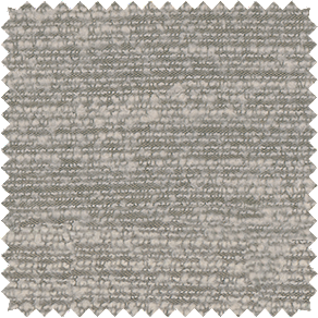
Linen,
Ecru
A softly textured fabric in a sandy color with a cool undertone.
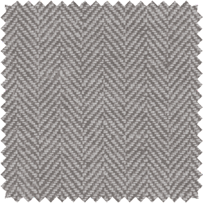
Herringbone,
Toast
A subtle herringbone pattern with visual and tactile texture in a warm, muted brown.
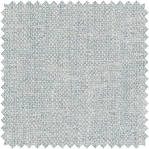
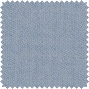
Heathered Linen,
Grey
A linen blend with soft heathered texture in a cool light grey.
Nate Berkus, Claude Stripe, Mineral
A linen blend features a luxe boucle stripe in a warm, beige tone.
Neutral Color Inspiration
Discover inspiring spaces curated with neutral-colored drapes to gather ideas for your own room and see how these subtle tones can truly transform a space.
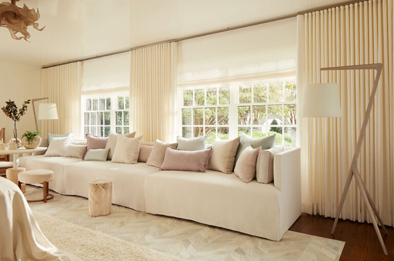
Warm, Neutral Living Room
Create a versatile, inviting space with warm neutral tones like creams and sandy tones. Drapery like Lily in Buff gives you a warm sandy color with a subtle east-west for a touch of visual. For a harmonious, space, pair your drapes with other sandy tones within a monotone color palette with variations in hue (lightness and darkness of a color) for design dimension.
Pictured: Tailored Pleat Drapery, Victoria Hagan, Lily in Buff
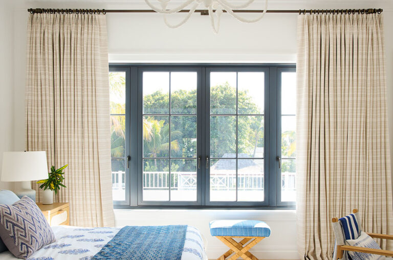
Rich, Earthy-Toned Sitting Room
Use more saturated neutral tones with a warm color temperature to create an earthy color palette. Surrey Stripe in Morel and Natural offers a beautiful, earthy backdrop with its alternating pinstripe pattern featuring two rich loamy colors for subtle visual interest. Create more depth in your design with other deep earthy colors like distressed wood furniture and stones used as décor.
Pictured: Pinch Pleat Drapery, Nate Berkus, Surrey Stripe in Morel and Natural
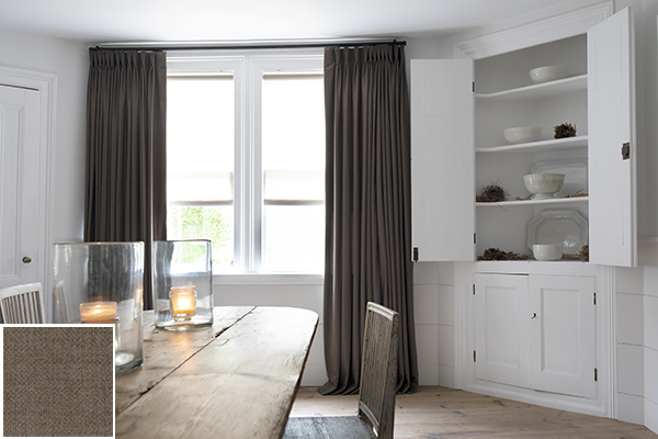
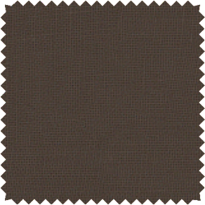
Simple Contrast in a Dining Room
To balance a dining room with white walls and a light-colored wood floor, use dark grey curtains, such as Wool Flannel in Walnut. The deep, rich tone will contrast beautifully with the bright walls and floors, grounding the space with its visual weight. For a subtle bridge between the bright white and the dark grey, choose a dining table made of aged wood with a touch of grey. The medium-grey tone will create a sense of harmony between the cool white and cool dark grey.
Pictured: Pinch Pleat Drapery, Wool Flannel in Walnut
Explore Fabrics for Colorful Curtains at Home
Colorful curtains are a great way to add personality and charm to your home. With so many color and fabric options available, it’s easy to find the perfect curtains to enhance your décor. Order free swatches of all your favorite colors to compare in your own home’s lighting. Whether you go for warm or cool tones or neutrals, colorful drapes are a sure way to make a statement in any room.
ORDER YOUR FAVORITE SWATCHES FOR FREE
Compare as many of your favorites from our collection of 1,200+ premium materials at home when you order free swatches online.