Find a Showroom
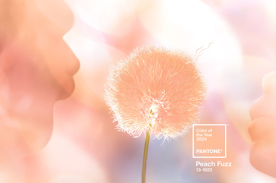
Your Guide to Color of the Year 2024 with Pairings
At the beginning of every year, paint and design companies alike announce their Color of the Year, a color that’s meant to evoke certain feelings that capture the spirit of the new year. The Color of the Year 2024 varies based on who you ask, but they all possess common themes: Each color this year speaks to a sense of mindfulness, kindness and reassurance. Working one (or more) of these colors into your home interior is bound to elevate your design with depth and modernity.
Discover a selection of the Colors of the Year to use as a paint color for your next interior redesign project.
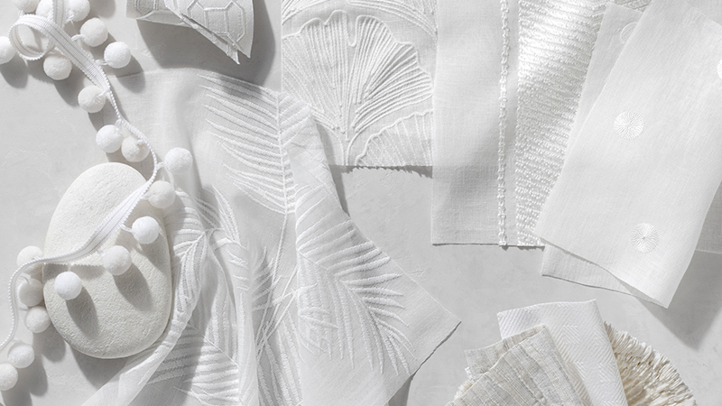
Cover Photo: Pantone®, Color of the Year 2024, Peach Fuzz, photo courtesy of Pantone®
Color of the Year 2024 Selections
These top Color of the Year 2024 selections from Pantone®, Sherwin-Williams®, Behr® and Benjamin Moore® range in their saturation, tone and depth so you’re bound to find the perfect fit for your home.
To help you decide on the right Color of the Year of 2024 for your space, learn about the color psychology for each to get important insight for how best to incorporate it into your design. Plus, discover complementary color pairings for window treatments, which you can also use as guidelines for other furnishings and décor elements. Finally, see inspiring examples of these colors used in curated spaces, with suggested window treatment parings, to help you visualize the possibilities for your own space.
Pantone Color of the Year 2024: Peach Fuzz
Imagine the soft, warm hue of just-ripe peaches — inviting and full of life. Pantone’s Peach Fuzz is somewhere between pink and orange, offering radiant warmth that evokes a sense of compassion and reflects our desire for closeness and connection. The vibrant hue also conveys a youthful vivacity, while still being modern and elegant, allowing you to dress it up in a formal room like a dining room, or dress down in a casual room like a family room.
Color Pairings for Peach Fuzz
Balance the brightness of Peach Fuzz with neutral tones like creamy off-white or warm greys or go for a lightly saturated tone like an earthy green for more complexity and depth. If you’re looking to make a bold statement, juxtapose this bright warm tone with a deep cool navy or a vibrant teal.
Ideas for Window Treatment Color Pairings with Peach Fuzz
Below are our top choices for Peach Fuzz color pairings for window treatments to get you started thinking about your options. Keep in mind you can use these colors as inspiration for other elements in your interior design.
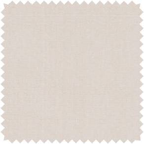
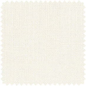
silk Dupioni In
Ivory
A warm, off-white tone made of a fine, lustrous silk that’ll balance the brightness of Peach Fuzz while adding a luxe element.
For Roman Shades & Drapery
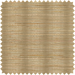
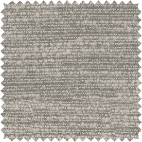
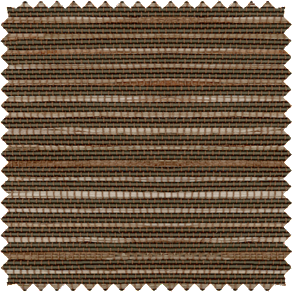
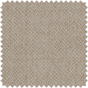
Artisan Weaves,
Coastline in Oat
A honey-colored tone made of knotted grass to complement the warmth of Peach Fuzz while adding lots of texture.
Nate Berkus,
Lisbon Woven in Agave
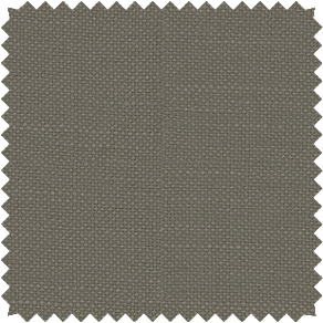
A muted green-grey hue made of a soft linen blend with subtle texture that will add complexity and depth when paired with Peach Fuzz.
For Roman Shades & Drapery
Luxe Linen in
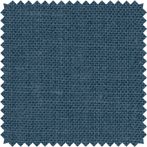
Midnight Blue
A deep, moody cerulean blue made of lush heavyweight linen that will create a bold juxtaposition with the warmth of Peach Fuzz.
For Roman Shades & Drapery
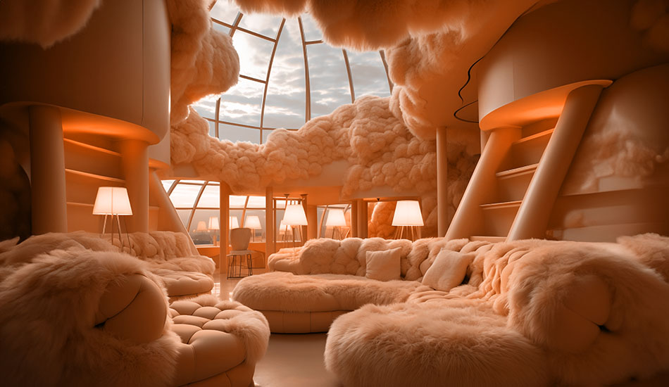
Curated Rooms Using Peach Fuzz: Before & After
See the ways Peach Fuzz enhances a room with these before-and-after examples to get ideas and inspiration for your own space.
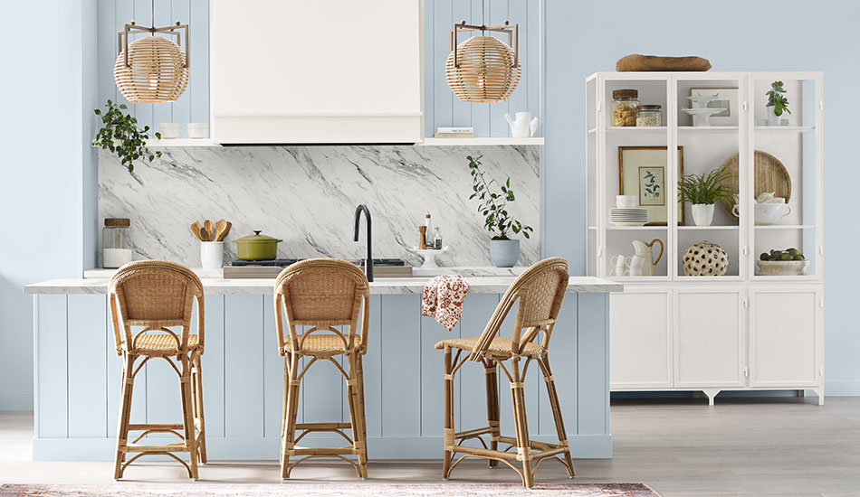
Bring Inviting Warmth & Vibrancy to Your Kitchen
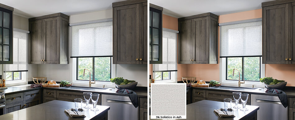
Peach Fuzz as the backsplash adds warmth and vibrancy to a kitchen with warm grey cabinets and gold accents. The beautiful soft peach color, with its mixture of elegance and its ability to evoke a sense of compassion is a perfect hue for a kitchen, where gathering with loved ones is a key feature. The Solar Shades in a textured grey color, 3% Solistico in Ash, keep the space bright by allowing lots of natural light to fill the space with a welcoming glow. Plus, the woven material adds visual and tactile texture to your space for greater design dimension.
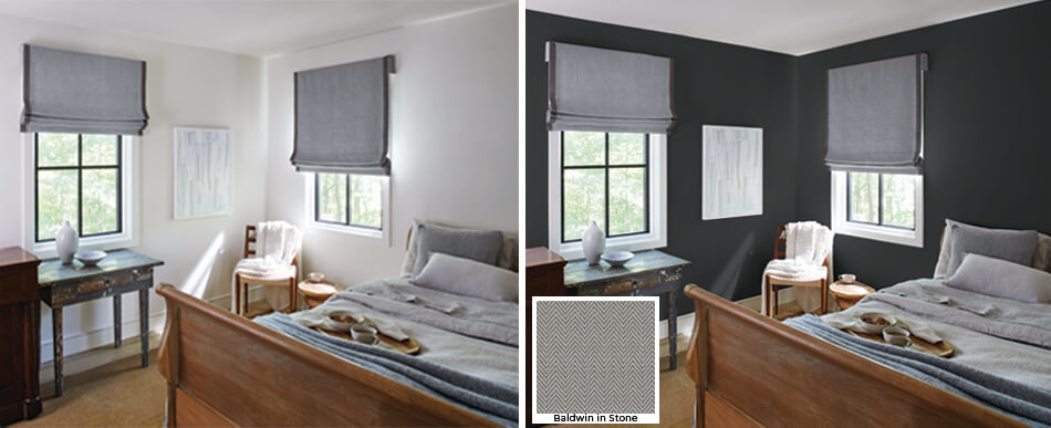
Create Comfort & Relaxation in a Modern Bedroom
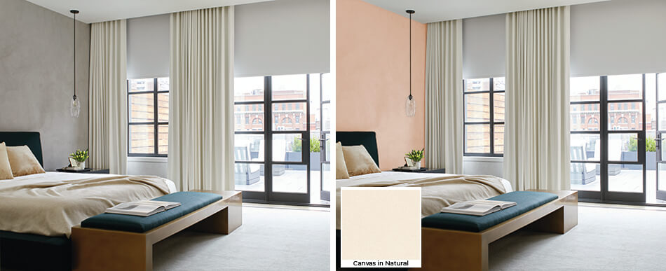
Use Peach Fuzz as an accent wall in your otherwise neutral-toned bedroom to bring added warmth and spa-like relaxation to the atmosphere. The soft peach colors pairs beautifully with the equally soft cream-colored, blackout-lined Drapery and bedding for an inviting combination. A deep navy blue accent color in the details like your bed’s headboard and footboard bench create contrast with Peach Fuzz that balances the brightness of the space. The blackout Roller Shade material in a soft white with subtle texture like Cora Blackout in White adds not only excellent functionality but also a final layer of dimension in your design. Plus, the combination of blackout-lined Drapery as well as blackout Roller Shade gives you an excellent room darkening effect for an improved sleep environment.
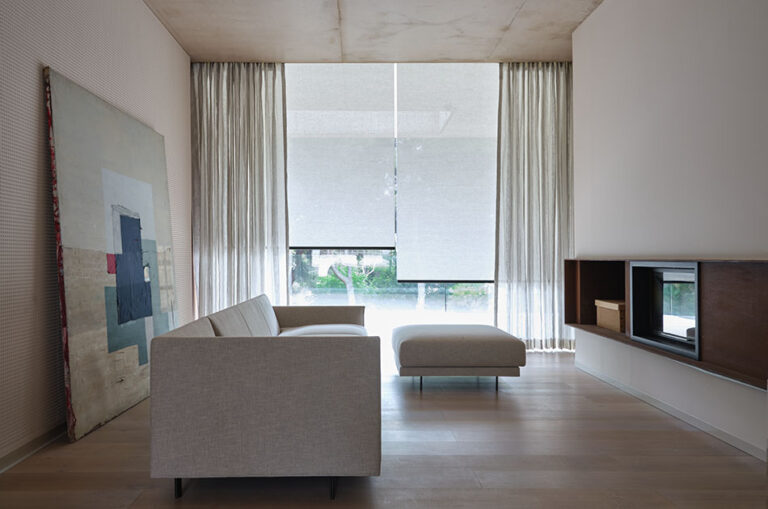
Sherwin-Williams Color of the Year 2024: Upward
Reflecting the endless expanse of a clear, sunny sky, Sherwin-Williams’ Color of the Year for 2024, Upward, adds an airy lightness to any room. The bright, blissful blue offers a refreshing sense of clarity that’s both calming and vivacious. It embodies the sensation of taking a slow breath of crisp air on a carefree sunny day.
Color Pairings for Upward
The lightness of Upward gives it design flexibility to be paired with equally light tones for a sense of openness or with deeply saturated tones for depth and contrast. Incorporate natural wood elements or woven textiles to echo its organic roots.
Ideas for Window Treatment Color Pairings with Upward
Below are our top choices for Upward color pairings for window treatments to get you started thinking about your options. Keep in mind you can use these colors as inspiration for other elements in your interior design.

Naomi in
White
A cool, clean white made of a beautiful, linen-like material that will softly filter light into your home and add to the brightness of Upward.
For Roller Shades
Nate Berkus, Claude
Stripe in Mineral
A light grey with warm undertones to balance the coolness of Upward, while adding a luxe visual texture with its boucle stripe.
For Roman Shades & Drapery
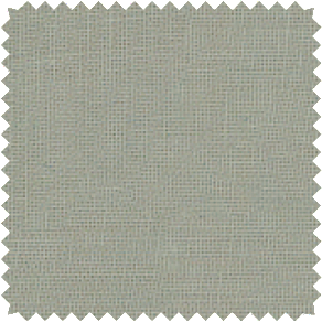
Linen in
Spring
A neutral, soft grey-green made of 100% cotton with a fresh, clean look to complement the sunny, natural hue of Upward.
For Roman Shades & Drapery
Artisan Weaves,
Beacon in Bark
A rich woven wood tone made of natural fibers with a heathered look to echo the organic feel of Upward while balancing its brightness.
Curated Rooms Using Upward: Before & After
See the ways Upward enhances a room these before-and-after examples to get ideas and inspiration for incorporating this calming color into your own home.
Embrace Rest & Tranquility in Your Bedroom
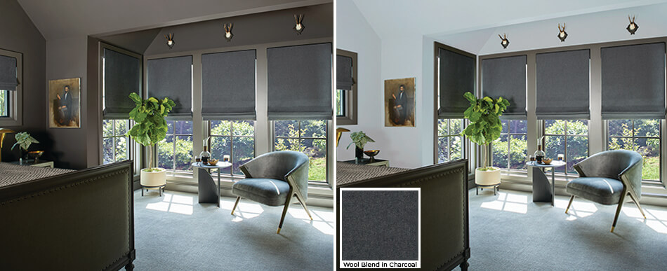
While a bedroom with a dark color scheme is cozy and inviting, it may also feel a little bleak, especially during periods of rainy or cold weather. To maintain that cozy, tranquil feel while brightening the space, choose sunny Upward. The cheery cool blue tone is vibrant while remaining soft and relaxing. It pairs well with dark grey Flat Roman Shades made of Wool Blend in Charcoal, as it draws out the cooler undertones of the fabric. Plus, the light and dark combination feels balanced and inviting. With so much brightness thanks to Upward, your existing darker décor elements like your deep grey accent chair and bed boards help to balance the space.
Cultivate a Sense of Calm at Your Workstation
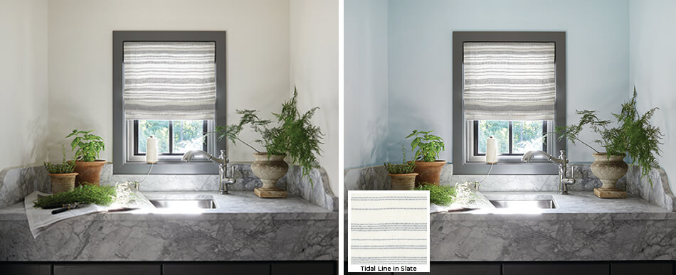
Transform your laundry room, mud room or gardening shed, with Upward for a serene yet vibrant workstation. For a place where you spend a lot of time with household chores, creating a cheery, invigorating atmosphere will only help to lighten your workload mentally. Use Upward on all the walls for a meditative space where you can perform your tasks mindfully and joyfully. Plus, the color pairs beautifully with the cool grey-and-soft white color scheme with grey marble, silver accents and a patterned Flat Roman Shade made of Tidal Line in Slate, creating a clean, modern look.
Behr Color of the Year 2024: Cracked Pepper
A soft black that embodies elegance and depth, Behr’s Color of the Year 2024, Cracked Pepper, is an approachable segue into dark, bold colors. The neutral, sophisticated color mixes well with nearly any design style and creates a grounded, timeless aesthetic. The deep, dramatic color evokes a sense of confidence and individuality, while adding a cozy element that feels organic thanks to the inky, earthy color.
Color Pairings for Cracked Pepper
This rich hue pairs exceptionally well with metallic tones like brass or silver, which add a luxurious feel. Wood accents can also introduce warmth and natural texture, balancing the room’s intensity. Creamy whites and warm greys also help to round out the richness of Cracked Pepper for an inviting, grounded aesthetic.
Ideas for Window Treatment Color Pairings with Cracked Pepper
Below are our top choices for Cracked Pepper color pairings for window treatments to get you started thinking about your options. Keep in mind you can use these colors as inspiration for other elements in your interior design.
5% Metallic in
Copper
A two-tone weave of warm, metallic colors with 5% transparency, for lots of light filtration to brighten your richly hued space.
For Solar Shades
Luxe Linen in
Oyster
A warm, bright off-white color to balance the richness of Cracked Pepper. Made of a heavyweight durable linen with a subtly textured weave.
For Roman Shades & Drapery
Artisan Weaves,
Bayshore in Sage
A beautifully textured weave with subtle knots and twists for visual and tactile texture in a rich wood tone that adds organic warmth.
Nate Berkus, Lowell
Tweed in Forest
A rich wool blend reminiscent of menswear suiting in a deep muted green to add greater depth and complexity to your design.
For Roman Shades & Drapery
Curated Rooms Using Cracked Pepper: Before & After
See the ways Cracked Pepper enhances a room these before-and-after examples to get ideas and inspiration for incorporating this deep, rich color into your own home.
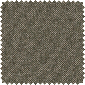
Create a Cozy, Comforting Bedroom
Upgrade the coziness of your modern colonial-style bedroom with Cracked Pepper. The earthy, rich tone adds depth to your design and complements the natural wood tones of your furniture. Flat Roman Shades made of subtly textured Baldwin in Stone gently brighten the walls with their light grey tone. Darker grey decorative tape on the edges bridges the color gap between the fabric and the walls for a gradient-like effect. Soft, inviting textiles such as throw blankets and bedding in soft whites and warm, light greys further help to create a comforting, inviting space.
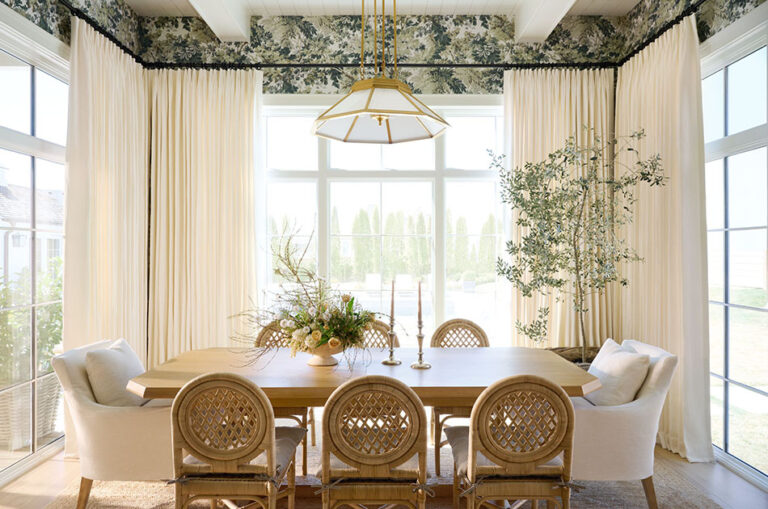
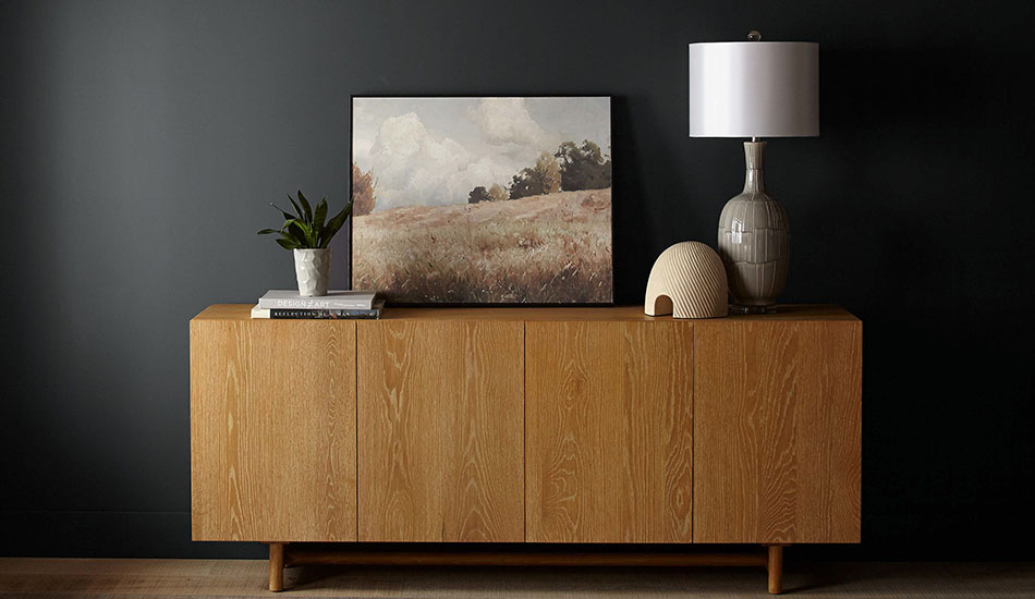
Embrace a Bold Look for a Dining Space
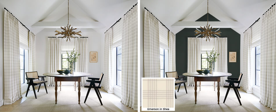
Add a bold look to your dining room with an accent wall painted with Cracked Pepper. The soft black beautifully complements the dark rich wood tone of the table and chairs while contrasting the soft creamy color of your plaid Tailored Pleat Drapery and Flat Roman Shades. The layers of plaid window treatments add an additional sense of warmth to the space, with their soft feel and creamy coloring. The light wood flooring and tan woven rug also help to brighten and warm the space.
Benjamin Moore Color of the Year 2024: Blue Nova
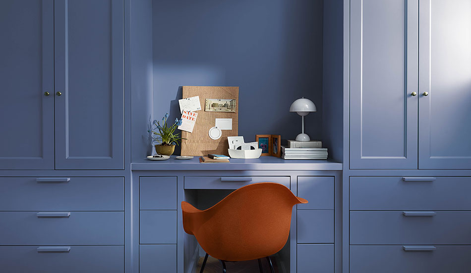
A breath of tranquility, Benjamin Moore’s Color of the Year for 2024, Blue Nova, is as timeless as the night sky. This contemplative blue balances depth and intrigue with classic appeal and reassurance. It offers a reprieve from the bustling world outside, endowing rooms with a serene, composed atmosphere. Plus, depending on how you use and pair Blue Nova with other colors and design elements, its design fluidity allows it to support a variety of aesthetic styles from coastal charm to urban sophistication.
Color Pairings for Blue Nova
Blue Nova pairs beautifully with creamy whites for striking contrast that helps to bring forward the deep blue’s depth and saturation. For a more grounded palette, pair it with earthy neutrals like sandy beiges or warm, stony greys. If you’re looking for a bold, playful twist, consider accents in coral or mustard yellow, which will add a pop of energy to Blue Nova’s peacefulness.
Ideas for Window Treatment Color Pairings with Blue Nova
Below are our top choices for Blue Nova color pairings for window treatments to get you started thinking about your options. Keep in mind you can use these colors as inspiration for other elements in your interior design.
Heathered Linen in Ivory
A warm creamy off-white to accentuate the depth and saturation of Blue Nova, made from a linen blend with a soft, subtle heathered texture.
For Roman Shades & Drapery
Holland & Sherry,
Wool Flannel in Sand
A warm, sandy beige that balances the depth of Blue Nova and is made from 100% wool for a soft, durable, fabric with an inviting brushed finish.
For Roman Shades & Drapery
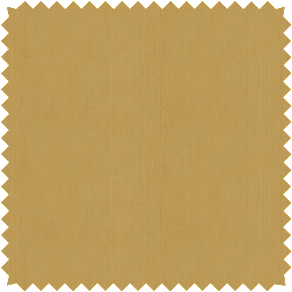
Silk Dupioni in Marigold
A rich golden tone in a fine, lustrous silk material that will beautifully contrast Blue Nova’s tranquil feel and add a touch of vibrant energy to your room.
For Roman Shades & Drapery
Nate Berkus, Lowell
Tweed in Flint
A dark, warm, stony grey to complement the depth of Blue Nova, made from a rich wool blend to bring a sense of elevated comfort to your space.
For Roman Shades & Drapery
Curated Rooms Using Blue Nova: Before & After
See the ways Blue Nova enhances a room these before-and-after examples to get ideas and inspiration for incorporating this deep blue hue into your own home.
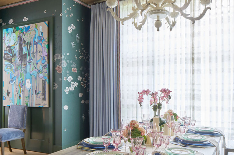
Enhance Concentration in a Creative Workroom
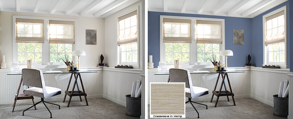
Embrace Blue Nova’s tranquility and sense of confidence to enhance concentration in a creative workroom. Use the deep blue for the upper part of your walls, above soft white wood siding. The classic combination of white and deep blue offers a timeless aesthetic with subtle coastal vibes. Dark wood toned and wrought iron furniture and décor pieces further ground the space and keep to the coastal theme which champions wood and metal accents. The soft light wood tones of the Woven Wood Shades made of Grassweave in Hemp, help brighten the darkly painted walls while creating additional design dimension with their woven texture.
Capture a Sense of Serenity & Composure in Your Bedroom
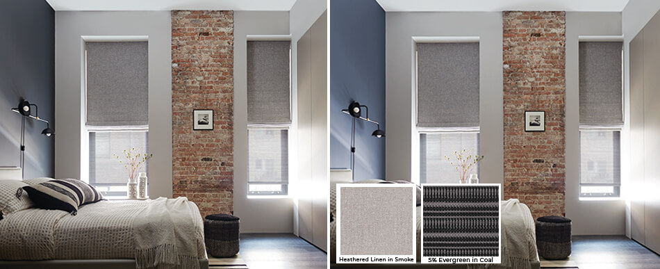
Harness the power of Blue Nova, with its serenity that brings a reprieve from the bustling world outside, to transform your bedroom into a tranquil sanctuary. A single accent wall behind your bed in Blue Nova is enough to ground your space and add a sense of depth that is reassuring. The deep blue beautifully complements the soft off-white walls while contrasting nicely with the distressed red brick accent. The Heathered Linen Roman Shades in cool grey Smoke offer a soft, inviting element to the windows while complementing the cool deep blue. Solar Shades made of 5% Evergreen in a similar cool grey, adds additional dimension with its highly textured weave — which also helps to soften the light for an inviting warm glow.
Discover the Perfect Color Combinations
With an inspirational introduction to the Color of the Year for 2024 from four influential companies, you likely have an idea of which color will best suit your next home redesign project. Along with your paint and color swatches of the colors of the year, order swatches of your favorite window treatment materials to discover the perfect color combination to round out your design. Be sure to look at all your color pairings in different lighting throughout the day to get a sense for the true hues and how they will work together in your space.
ORDER YOUR FAVORITE SWATCHES FOR FREE
Compare as many of your favorites from our collection of 1,200+ premium materials at home when you order free swatches online.